Kindle Visual Design
The visual side of the Kindle. The font fix the experts missed, the 1-bit UI that made it feel instant, the icon, and the screensaver art.
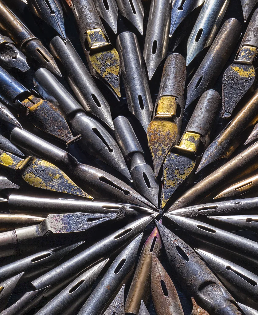
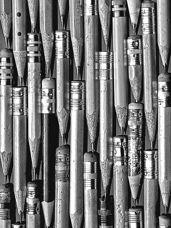
On the Kindle, the fonts seemed to shift typeface as you stepped the size up and down. A subtle thing, and a hard one to pin down. Typography experts and type foundries had looked at the code and kept saying it was the correct file, the same font. Nobody dug deeper. My new VP of Design handed me the puzzle, with an executive review two weeks out and a plan expected. I was glad to take it on.
Separately, leadership was unhappy with the touch performance on a new Kindle. A tap sometimes lagged so long that the user tapped again and again, stacking the device into a frozen spinner and making it inoperable. The engineering team was on the hook and was not sure what to do.
Deep dive the fonts
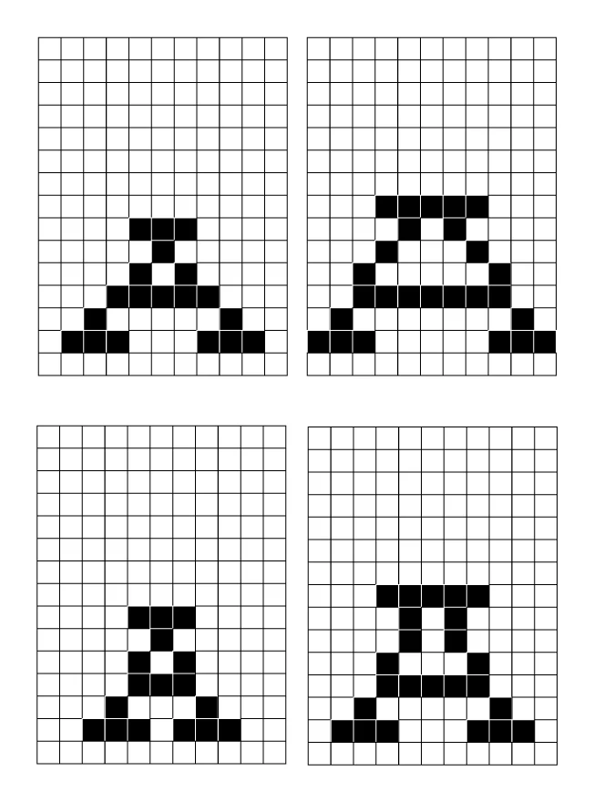
A colleague modded a Kindle so I could set type sizes at will instead of the shipping presets. I took Helvetica, set it to size 6, took a screenshot, set it to 7, took a screenshot, and repeated. Then I mapped each form in Photoshop.
Find the pattern
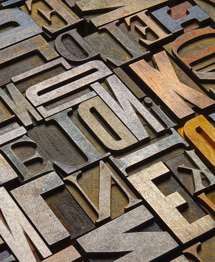
Moving from odd to even sizes, a font grew in height or in width, but never both at once. So the odd sizes looked fat and stubby and the even sizes looked narrow and tall. I checked more fonts. It was consistent. The software was ramping the type by number, not by form.
Champion 1-bit
I had been pushing 1-bit UI, solid black pixels only, to the point that my nickname around the lab was 1-bit. With three junior software engineers we built the first 1-bit UI in a few days to test whether it could refresh the screen fast and still look good with no ghosting from the E-Ink.
Art-direct the screens
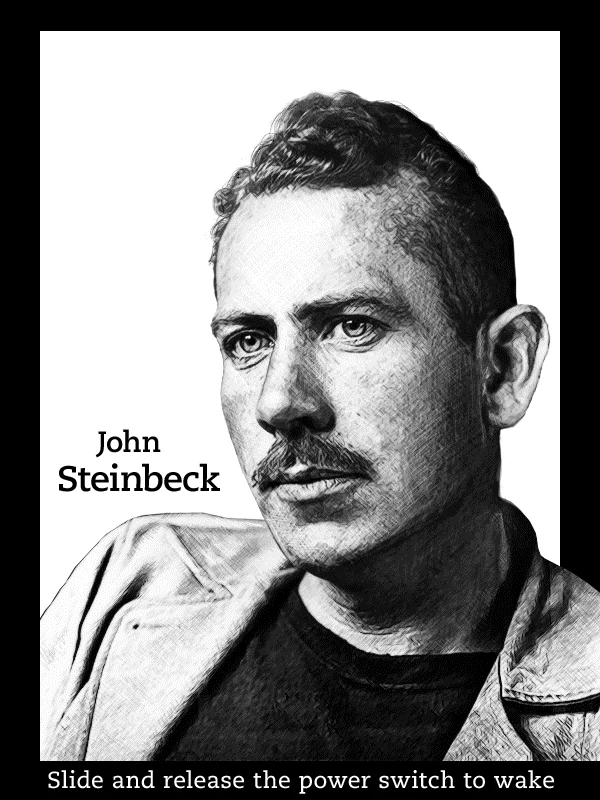
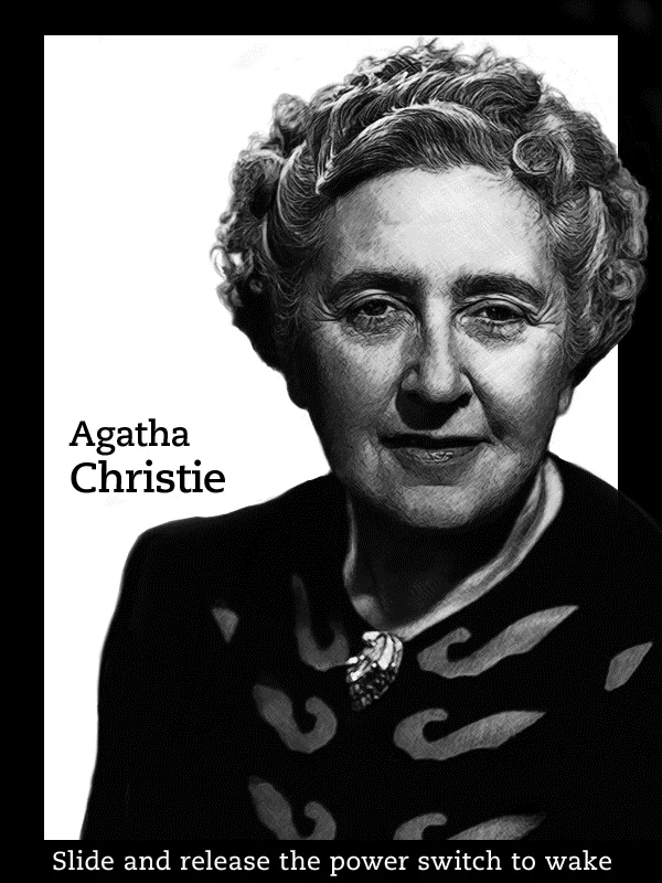
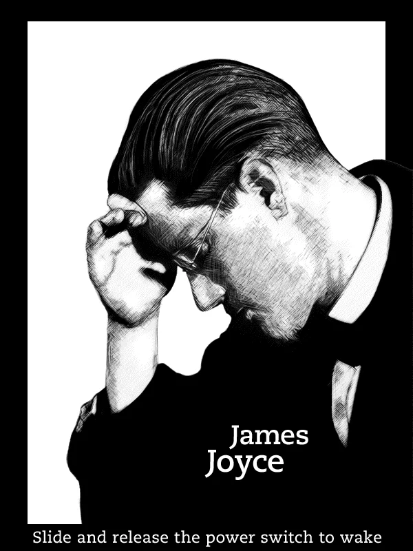
On the device itself I directed the screensaver series and rebuilt the Kindle icon. The author portraits used a technique of photography, pixelation, and brush strokes to pop contrast on E-Ink. The Reading and Writing series was shot with photographer Bruce Ashley.
A form-based font ramp instead of an arbitrary number ramp. Same typeface, sized so each step reads as the same face getting bigger, not a different one.
The review was moving along, then the fonts came up and the room turned to me. I walked through the maps. They picked a ramp, approved it on the spot, and the issue was closed. A handshake and a great job on the way out. I have never forgotten it.
| Piece | What changed |
|---|---|
| Font ramp | Sized by letterform, not by number |
| 1-bit UI | Solid black pixels, faster feedback |
| Icon | Barcode refined into the Kindle mark |
| Screensavers | Photo, pixelation, brush stroke for E-Ink |
Instant feedback
The feedback flash on a button tap went from 2.5 seconds to .25 milliseconds on E-Ink. Almost instant. The win was not in the code, it was in how we loaded and unloaded graphics in the system.
Less ghosting
The 1-bit graphics also cleaned up ghosting, a built-in problem with E-Ink. Engineering got a solution and the UI still looked good.
Eight-week sprint
Revamped every dialog, menu, button, and checkbox to 1-bit, with a Human Interface Guidelines doc written at the same time for the dev team. Product, Development, QA, and UX each took ownership of their part. It shipped.
Author series
Twelve author portraits on the Wacom, mixing photography with pixelation and brush strokes for contrast on E-Ink.
Reading and Writing series
Twenty images art-directed with photographer Bruce Ashley, from concept and shot setup through cropping.
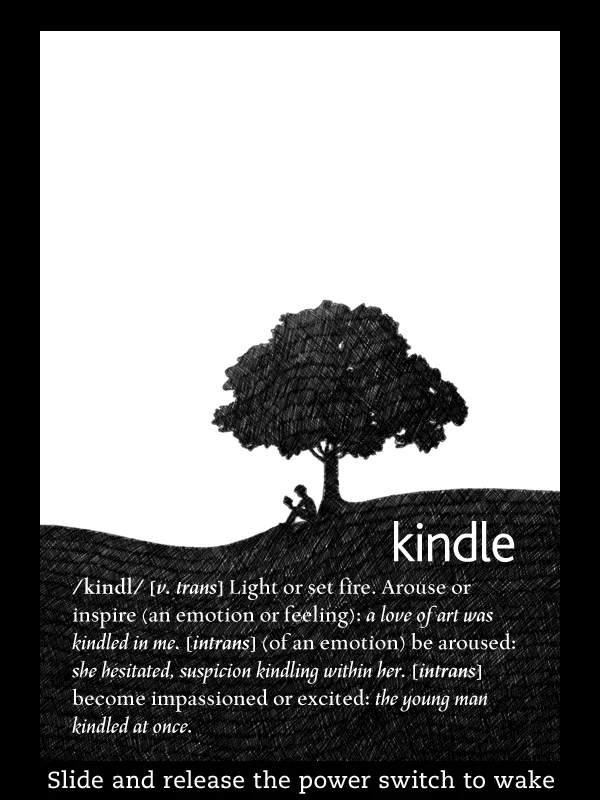
Kindle icon
Started as a low-fidelity barcode and got refined in Illustrator into the mark used across startup screens and collateral.
— Font Resolution
— 1-Bit Interface
— Kindle Icon
— Author Screensavers, E-Ink
— Reading & Writing Screensavers, Kindle Fire
— Reading & Writing Screensavers, E-Ink
Two CEO-level problems and a body of on-device art, each with a clear before and after.
Sizes ramped by number, the face looked like it changed
Sizes ramped by form, one face scaling cleanly
4-bit UI, 2.5s feedback, taps stacked into a freeze
1-bit UI, .25ms feedback, less ghosting
Low-fidelity barcode
Refined mark used across the ecosystem
The font ramp shipped, the 1-bit UI shipped across the line, and the screensaver art became part of how the Kindle looked at rest.
Button feedback on E-Ink
Kindle versions
1-bit revamp + HIG
Screensaver images, authors + photos
The font ramp fix end to end. The 1-bit UI direction and the team that built it. The Kindle icon. Art direction on the author and Reading and Writing screensaver series.
Palo Family Video Device
Want something like this?
Start a conversation→