Fortris Command
Designing and shipping enterprise fleet-management UX at scale — a 35-page production dashboard with design-system governance.
Fortris Command is a production fleet-management dashboard used by operators daily. It had to reach parity with a legacy Battle Console while modernizing the experience — and it grew to 35 distinct page surfaces, from Dashboard and MyFleet to TPMS, VehicleHealth, Inspections, Routes, Revenue, Billing, and Administration.
At that surface area, the risk isn't building a screen — it's governance. Thirty-five pages built without a system become thirty-five different products. The challenge was to design once and apply everywhere, with typed contracts strict enough that the app stays coherent as it scales.
A drillable card system
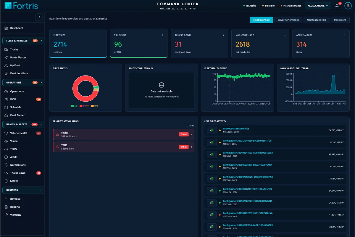
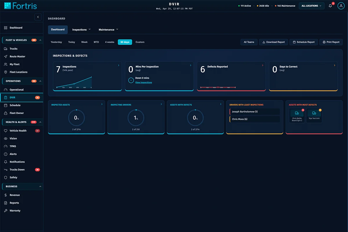
The design system centers on two primitives — DrillableCard and KpiCard — with documented spacing, typography, and hover behavior. KPI cards drill into filtered lists; two-row, eight-tile dashboards give operators a glanceable command view. Documented in docs/Fortris-App_CONTEXT.md so the pattern is governed, not improvised.
Typed contracts everywhere
24 Zod schema files validate the data crossing every boundary. In an enterprise dashboard pulling live fleet data, typed contracts are what keep 35 pages from drifting into inconsistency — and what let the team ship confidently against a moving backend.
Real enterprise plumbing
Axios with JWT auth, Vitest + Testing Library for tests, Sentry for error monitoring, Stripe for billing. The stack signals that this is a real product with real customers, not a prototype.
With 35 pages, the system is the product. Governance lives in a context doc and a small set of primitives that every page composes from.
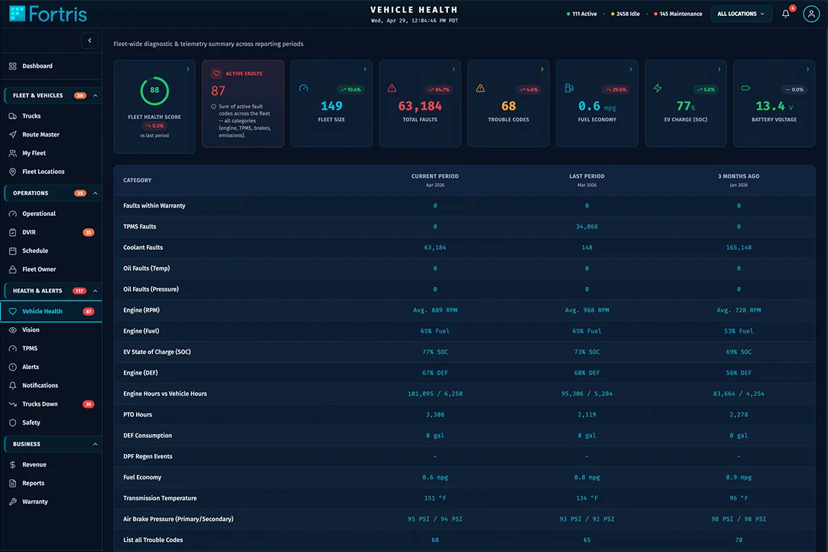
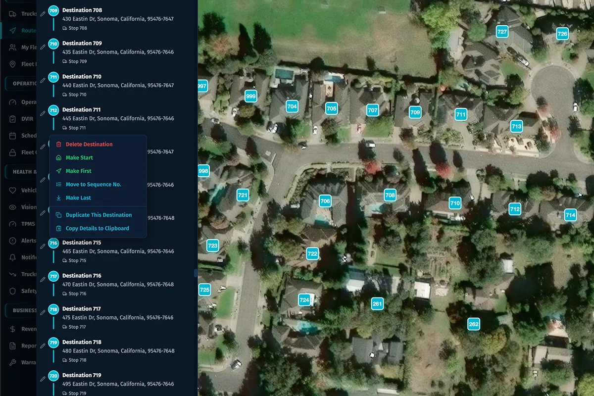
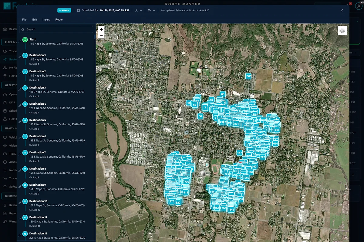
Recharts powers the data visualizations; Leaflet + react-leaflet power FleetLocations maps. The card system and spacing rules are documented so new pages inherit the standard instead of reinventing it.
| Primitive | Role | Behavior |
|---|---|---|
| KpiCard | Headline metric tile | Drills into a filtered list |
| DrillableCard | Composable content card | Documented hover + spacing |
| Dashboard grid | Command overview | Two rows × eight tiles |
| Zod schemas (24) | Typed contracts | Validate every data boundary |
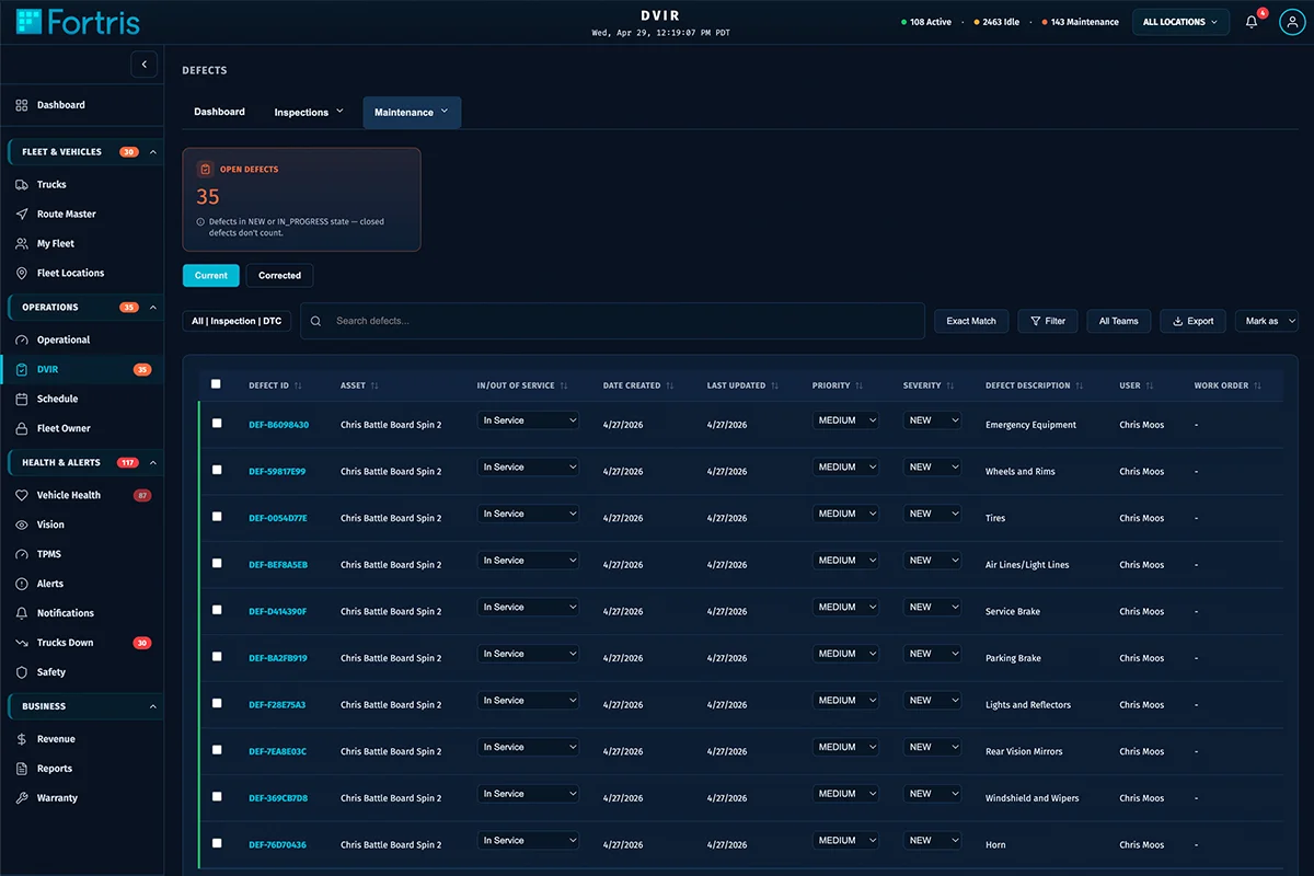
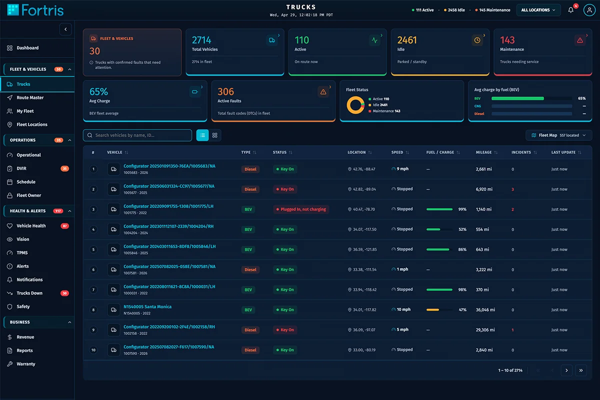
Drill interaction
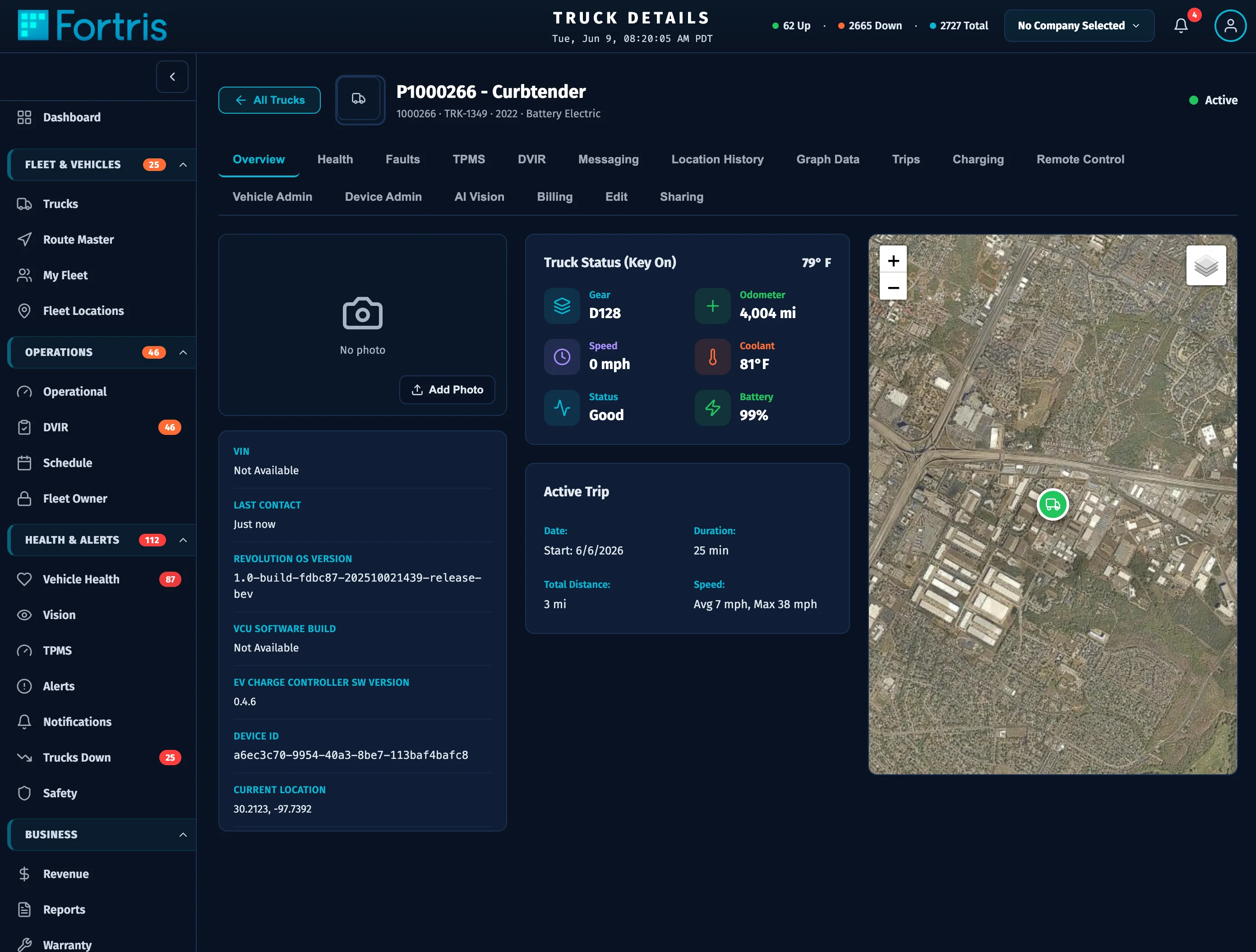
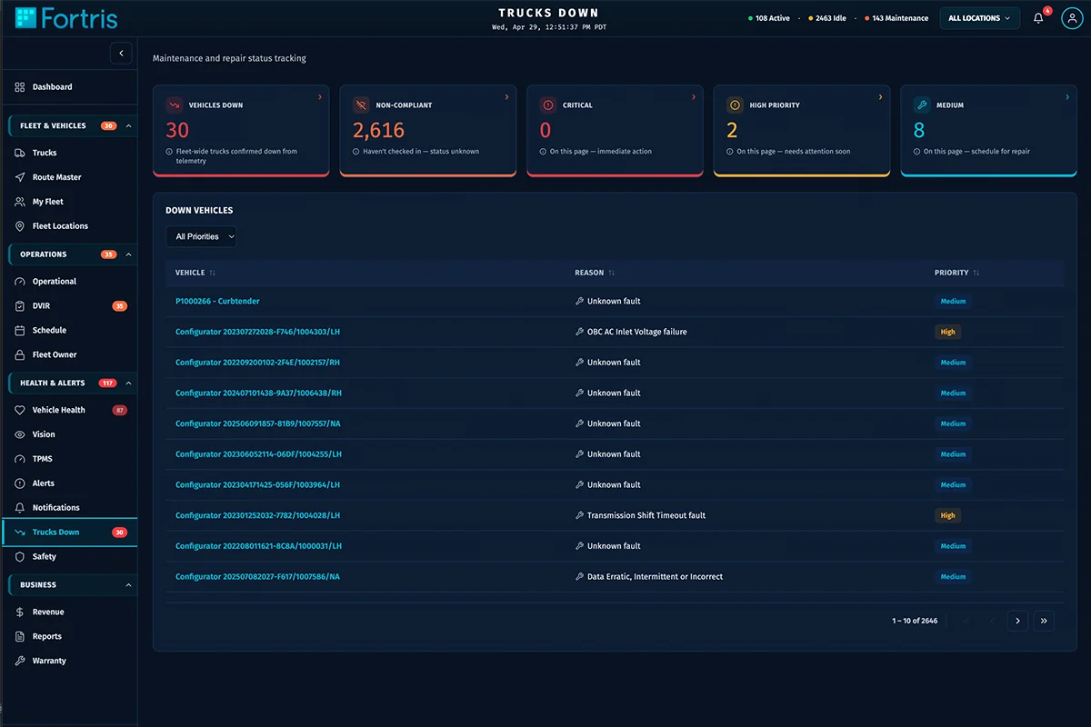
The signature interaction: a KPI card drills into its underlying filtered list. The transition has to feel instant and traceable so an operator never loses context — motion in service of comprehension, not spectacle.
Data in motion
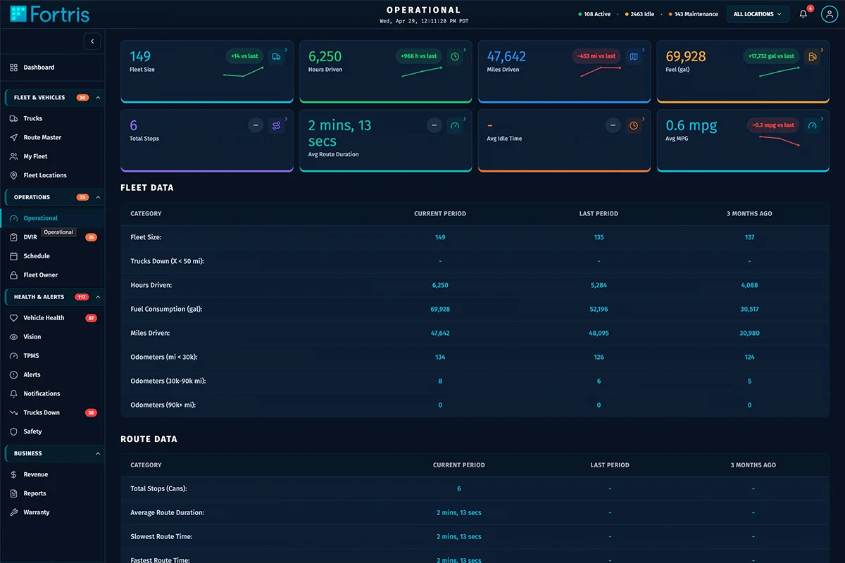
Recharts visualizations and live map updates animate as fleet data changes, keeping a dense operational view legible at a glance.
Command dashboard
A two-row, eight-tile overview giving operators the state of the fleet at a glance, each tile a drillable KPI.
Operational surfaces
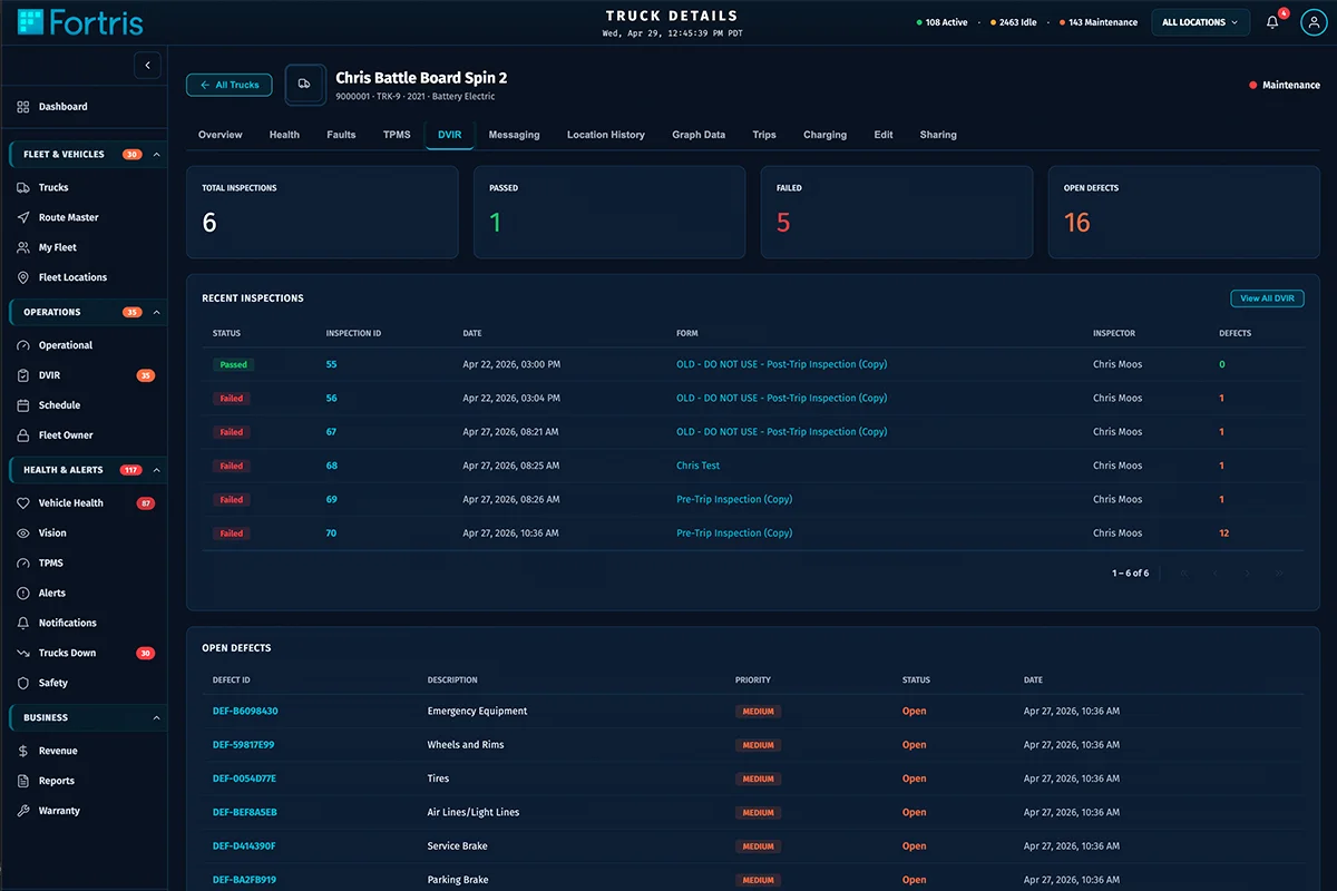
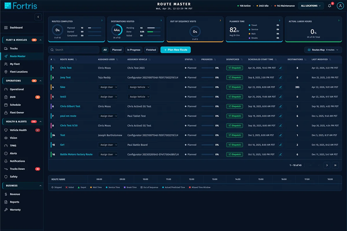
MyFleet, Trucks, TruckDetail, TrucksDown, FleetLocations (map), Routes, Schedule, Inspections, Safety, TPMS, VehicleHealth, Alerts — the daily operating surface for a fleet.
Business surfaces
Revenue, Billing (Stripe), Companies, FleetOwner, Warranty, Reports, plus Administration and MDM admin tooling — the full enterprise envelope around the operational core.
Built for parity against a legacy Battle Console, then taken past it — same coverage, modern stack and UX.
Legacy Battle Console
React 18 + Vite, 35 modern surfaces
Per-screen one-offs
DrillableCard / KpiCard system, documented
Untyped data flow
24 Zod schemas validating every boundary
A production enterprise dashboard that scaled to 35 pages without fragmenting — the proof point that I can design and front-end a real SaaS surface at scale.
Page components in production
Zod schema files
Shipped, in daily use
Documented design system
Major versions shipped
TypeScript — typed at every boundary
Original wireframes and end-to-end UI/UX in Figma, design-system definition (DrillableCard / KpiCard), dashboard information architecture, front-end implementation, typed-contract discipline with Zod, and the governance documentation that keeps 35 pages coherent.
2027 Raider ICE Data Book
Want something like this?
Start a conversation→