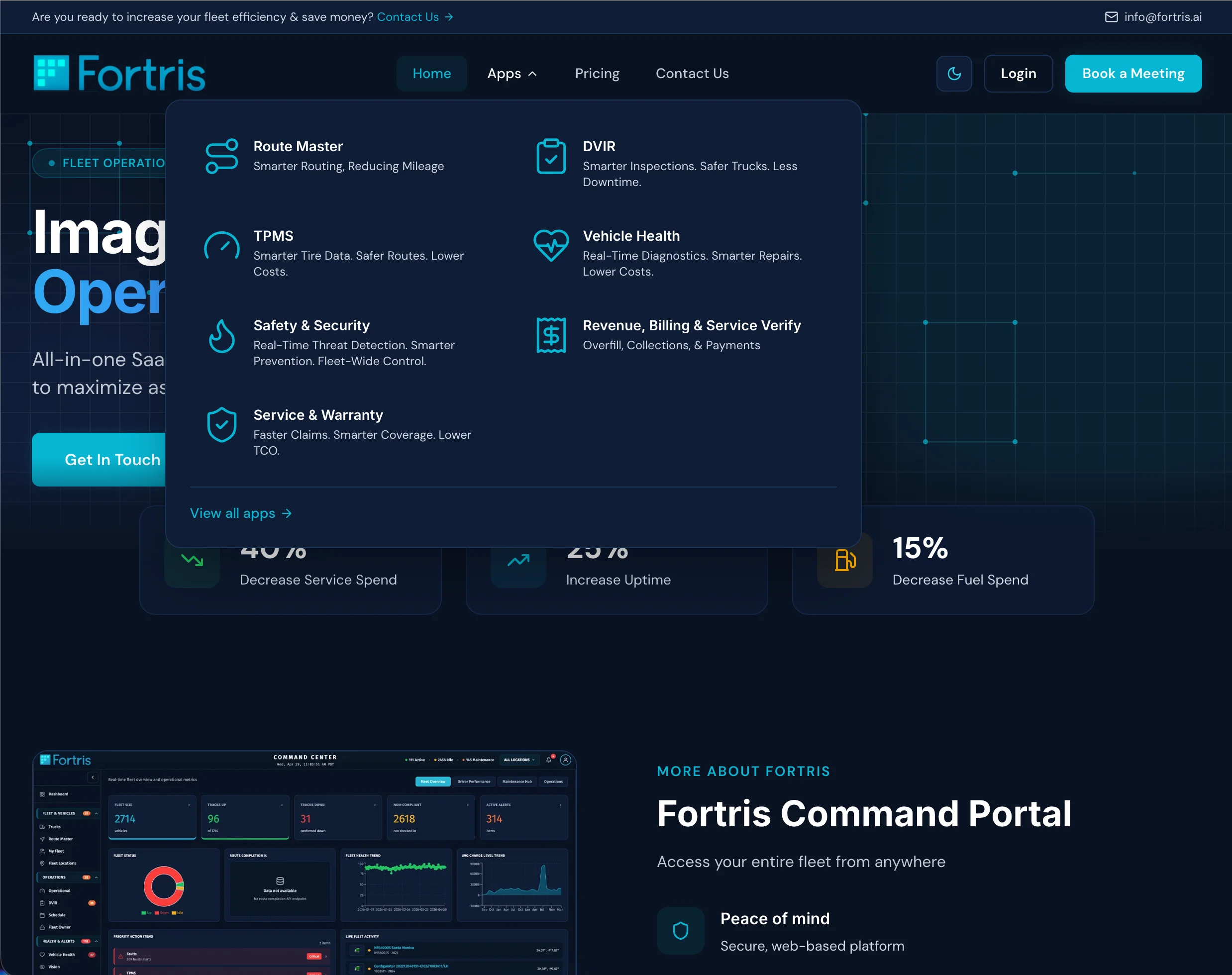
Fortris.ai Marketing Site
Rebuilding a B2B SaaS marketing site from static HTML into a Next.js 14 design system in two months.
The original Fortris.ai site was a static, Bootstrap-era build — seven hand-coded HTML files, 58KB on the home page and 90KB on pricing, a PHP mailer behind the contact form, and no shared design system. Adding a section meant editing every page. Adding a theme meant editing every rule. It read like product marketing from a different decade of the web.
The product on the other side of that site was the opposite: a modern fleet operations platform in the same ecosystem as the Battle Motors Command portal, used daily to monitor vehicle health, route compliance, safety alerts, and revenue. The disconnect was loud — real product signal sold by a site that looked generated, not designed.
The brief: rebuild the marketing site as a modern Next.js application aligned to the Command portal so a customer moving from marketing to product feels one brand. Constraints were aggressive — keep static export so hosting stays cheap, hit a public ship date in early May, and document the system clearly enough that other engineers and writers could extend it without me.
Tokenize everything
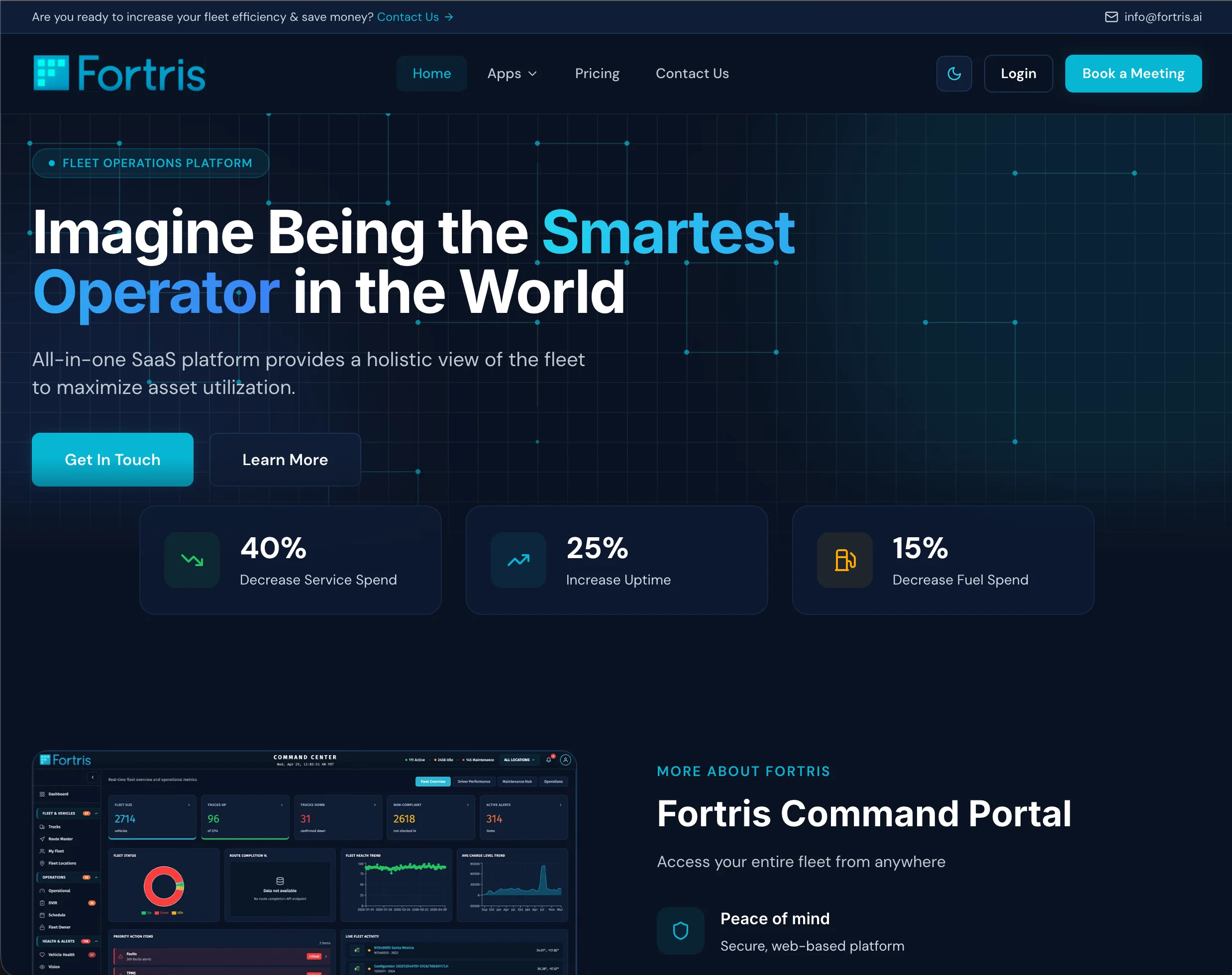
Before writing a single component I built a six-axis CSS custom-property token system in globals.css — background, card, surface, border, text, accent, plus shadow, overlay, hero-gradient, and glass. Each token carries a light and dark variant; components consume them through Tailwind mappings. The result: a theme toggle changes the whole site in one frame, and adding a page means picking from a vocabulary instead of inventing values.
Match the product accent
The site accent is cyan #06b6d4 — not arbitrary, it's the exact accent used in the Command portal. A customer who clicks 'Sign In' and lands in the product sees the same color hold the brand together. That alignment is documented in AGENTS.md so it survives whoever touches the code next.
Build a motion vocabulary, not effects
Motion is a system of recurring primitives, not decoration applied per element. Five primitives get reused across the site: scroll-triggered enters on a designer's cubic-bezier, spring-physics counters, slow drifting orbs, a self-drawing geometric grid, and pulsing concentric rings on legal heroes. Each lives in its own module so it can be grabbed anywhere.
Static-export discipline
The site uses Next.js static export, not SSR. Build output goes to out/, .htaccess is carried over in a postbuild step, and search engines are notified via IndexNow. Hosting is a static file server — cheaper, faster, harder to break. The kind of decision that doesn't show up in a screenshot but separates a site that runs clean for years from one that needs babysitting.
The system fits on one page because it's deliberately small: six color axes, two typefaces, one accent, five motion primitives. Anything more lives inside Tailwind (spacing, radius, sizes) or the token layer (everything that needs theming).
Inter for headings (variable, 4xl–7xl on the hero), DM Sans for body at 1.6 line-height. A .glass utility provides the frosted-card look; selection color is cyan-tinted so even OS-level text selection feels part of the brand.
| Token | Value | Use |
|---|---|---|
| --bg | #0a1222 | Primary background |
| --card | #0f1d35 | Card surfaces |
| --surface | #1a3355 | Secondary surfaces |
| --accent | #06b6d4 | Buttons, links, active states |
| --text | #ffffff | Primary text |
| --text-secondary | #c0c8d4 | Captions, secondary copy |
Hero enter sequence
Three stacked elements — eyebrow pill, headline, subhead — each enter from opacity 0 / y 30 over 0.7s with staggered 0 / 0.1 / 0.2s delays and a custom easing of [0.16, 1, 0.3, 1] that overshoots slightly and settles. Reads as a purposeful, confident reveal rather than elements snapping into place.
Self-drawing geometric grid
The signature element. A faint 60px dotted grid carries ten geometric squares that draw themselves into existence via a buildAnimations helper — each square defined as four corner points plus a drawOrder for its edges, animating on independent delays. Buyers literally watch the geometric DNA of the brand assemble.
Atmosphere, not events
Two large radial-blur orbs drift behind the hero over 18–20s loops, slow enough that a viewer doesn't notice consciously but feels the space breathe. Pulsing concentric rings on the legal-page heroes mirror a radar ping — reinforcing the operations-platform identity without saying anything literal.
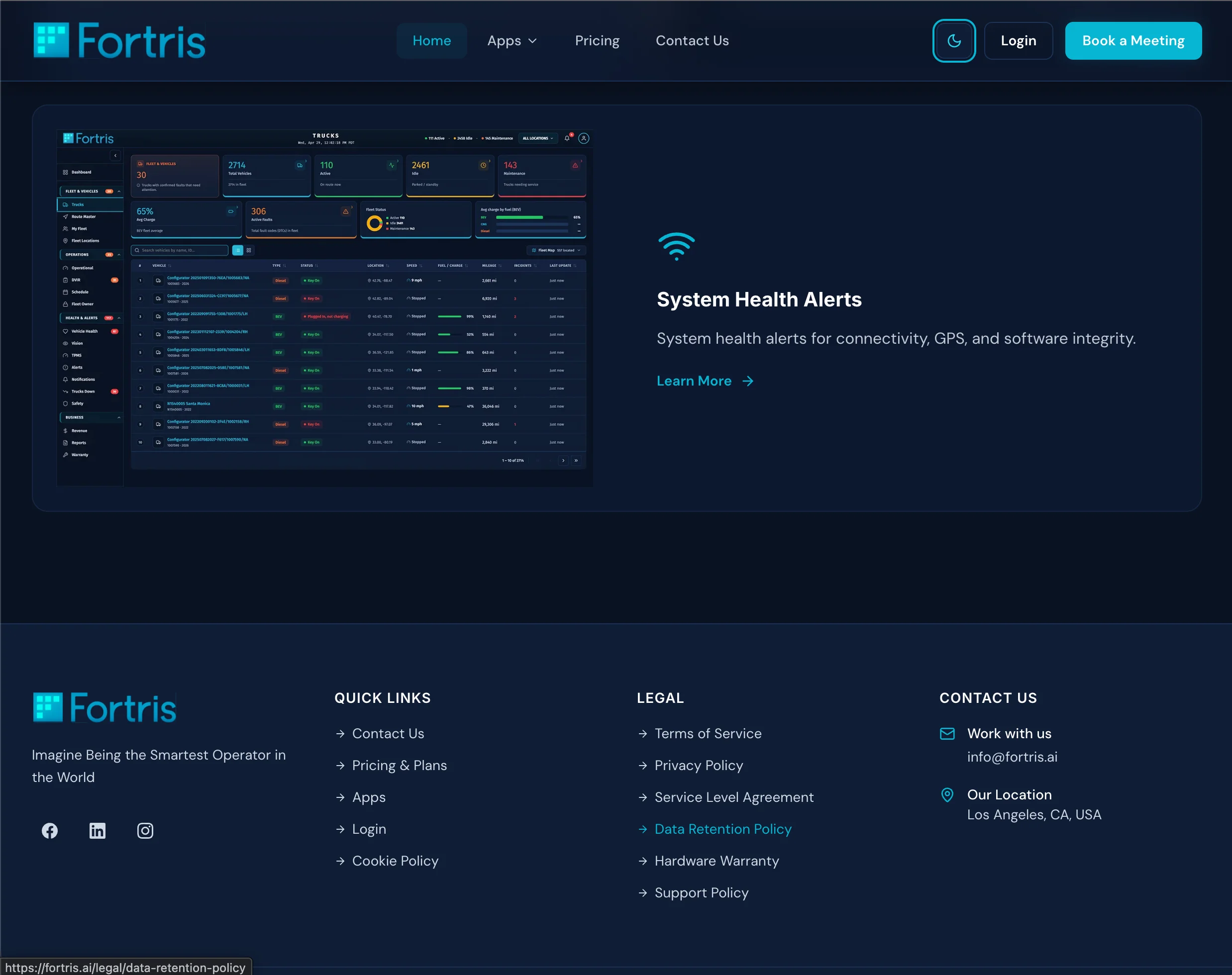
Home hero
Headline appeals to identity, not features: 'Imagine Being the Smartest Operator in the World.' Eyebrow pill with a pulsing cyan dot, a single Request-Demo CTA, geometric squares and orbs running continuously behind the type.
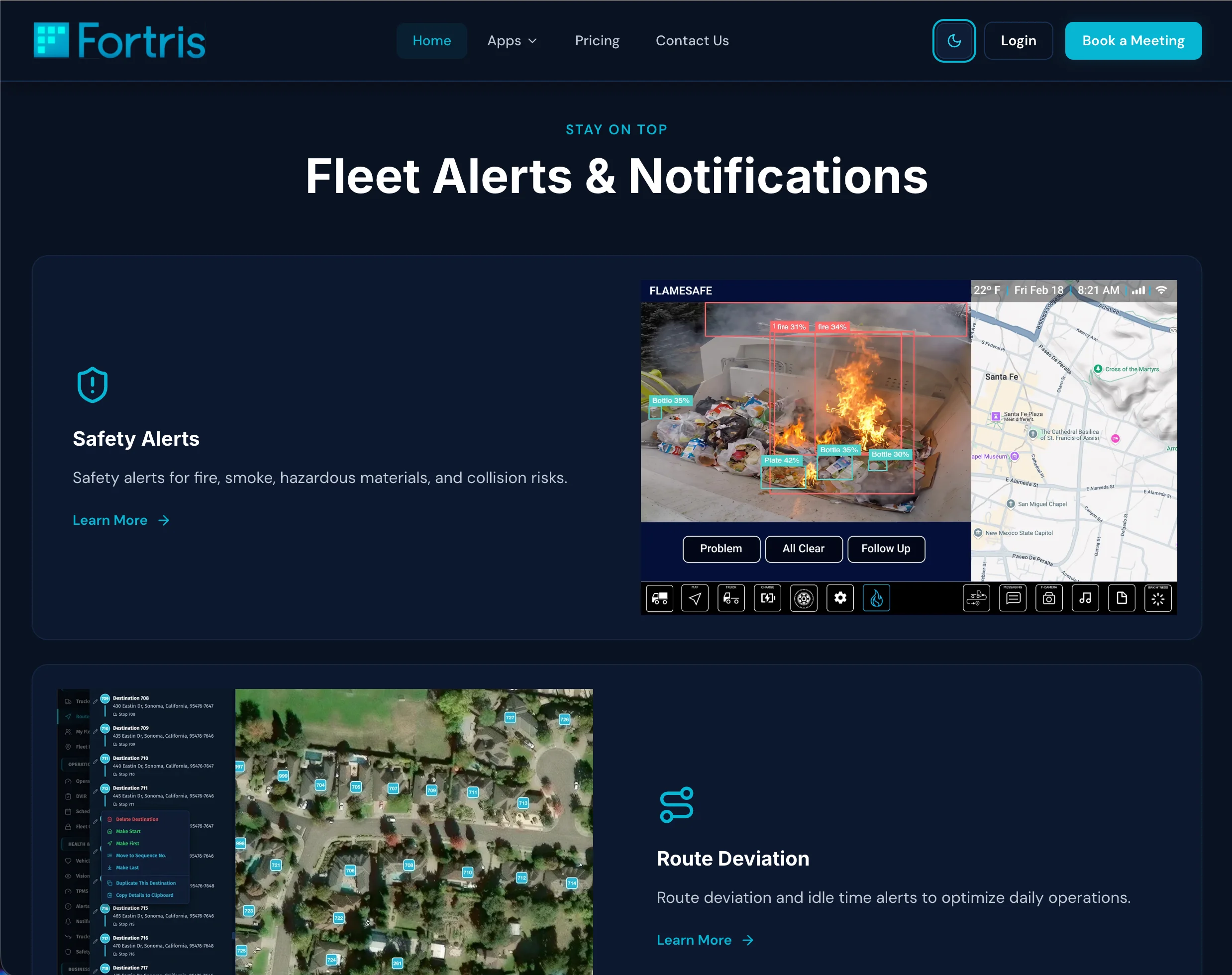
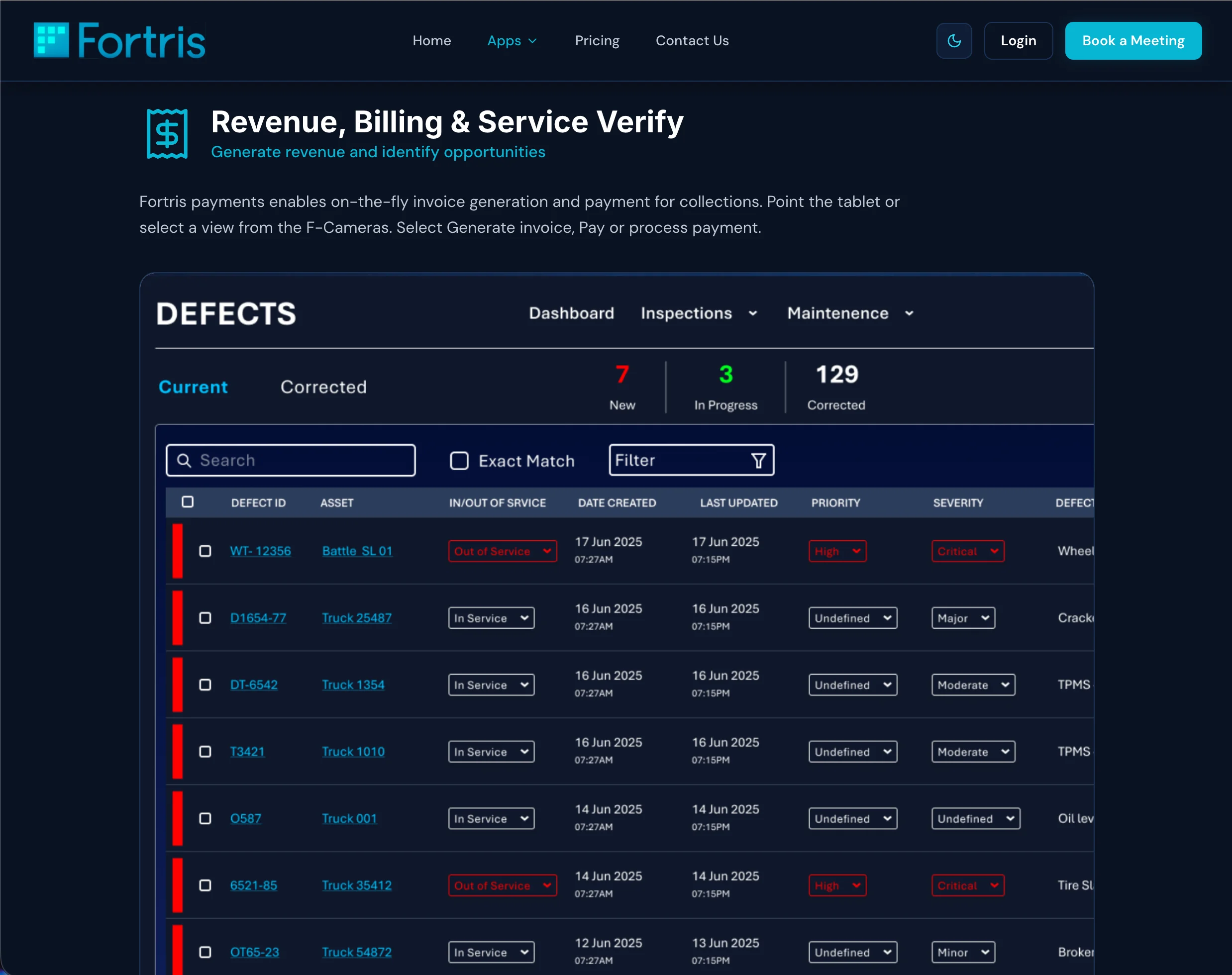
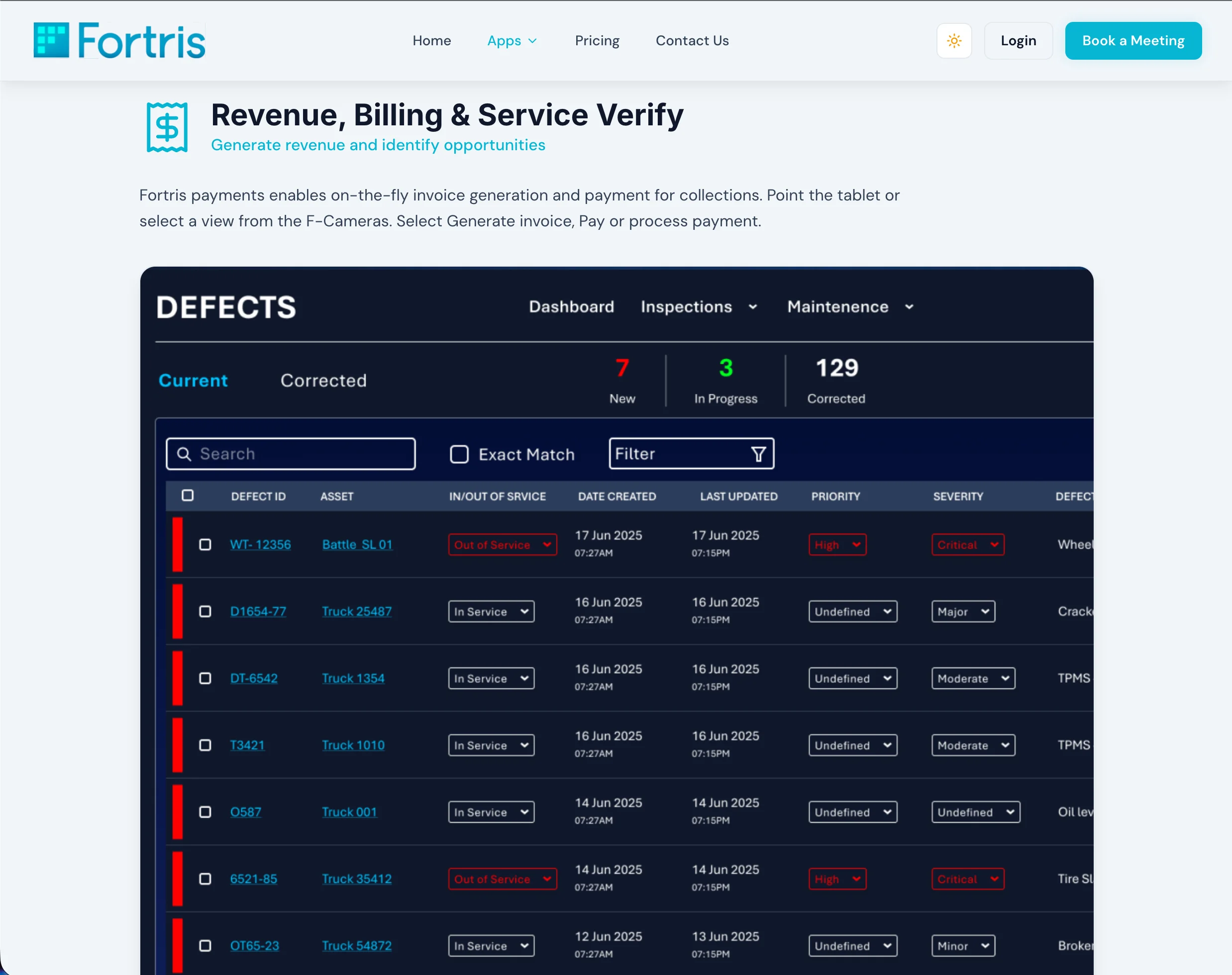
Service cards
Two grids of six cards — Fleet Performance Insights and Fleet Alerts. Each is a Lucide icon, title, description, image, and deep-link to the relevant /apps section. Alternating image/text layout creates editorial rhythm; the cards are system components, not bespoke layouts.
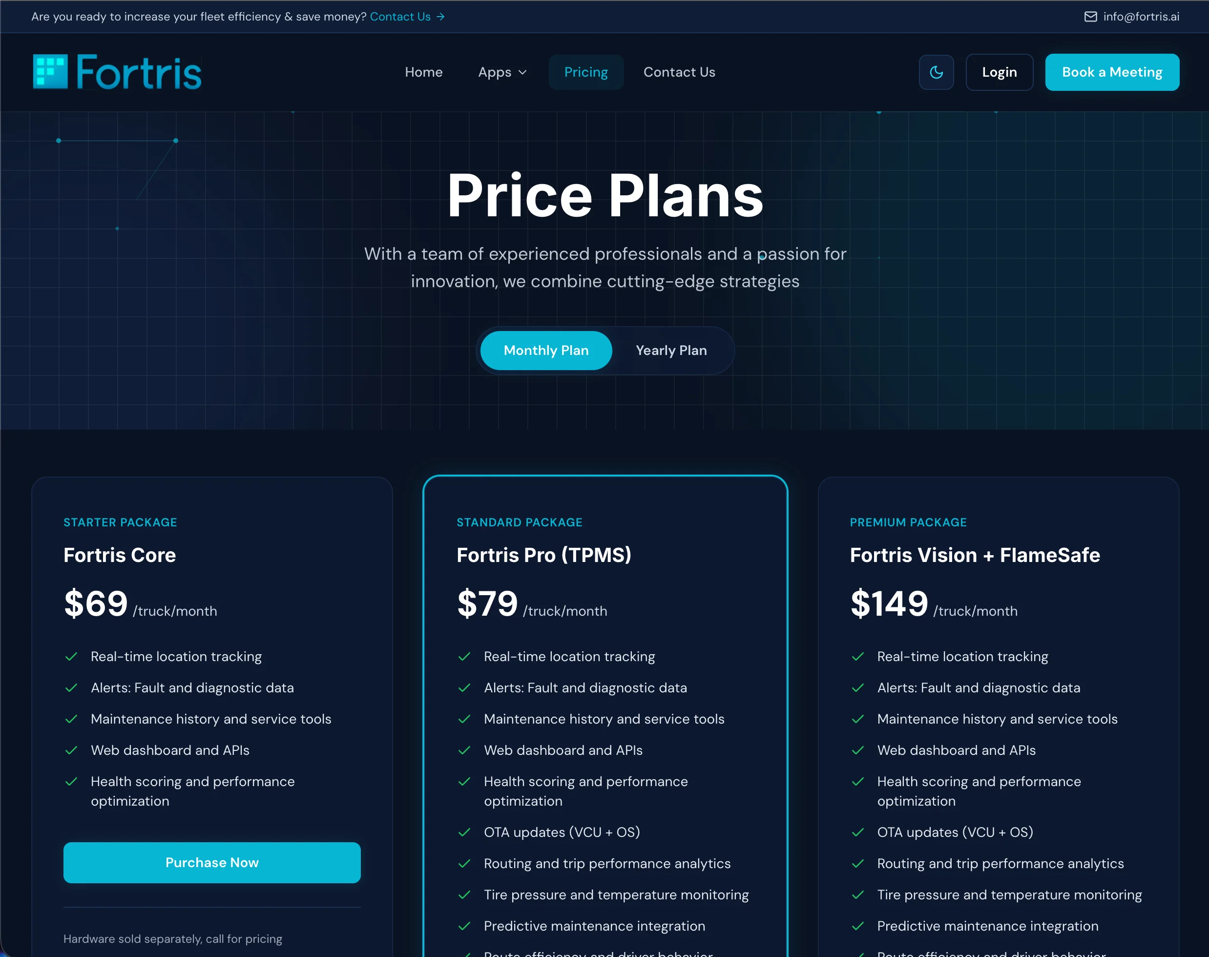
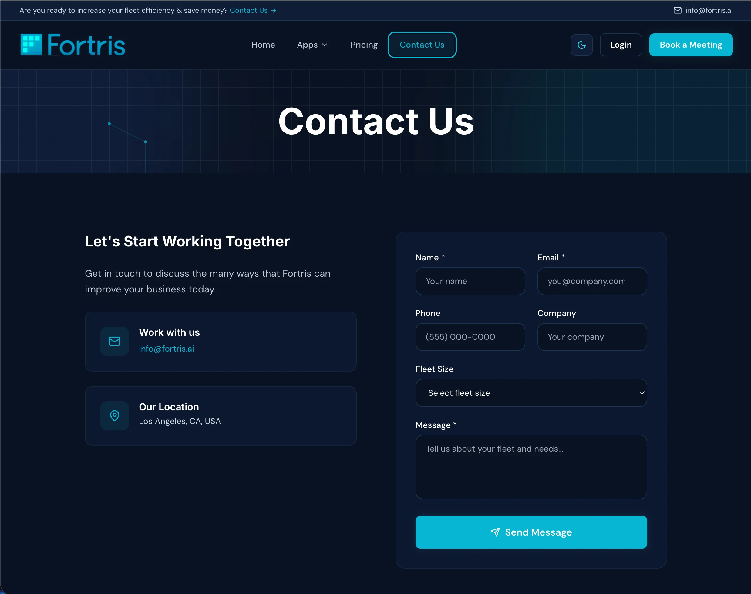
Pricing & legal surface
Three tiers with an animated monthly/yearly toggle that reveals savings as a chip. Six dedicated legal pages — terms, privacy, SLA, data retention, hardware warranty, support — all wrapped in one LegalPage component. The surface most SaaS sites neglect, treated as part of the brand.

The _old_site/ folder is preserved in the repo — seven HTML files plus a mailer.php and a separate legal folder, ~420KB of static markup. pricing.html alone was 90KB of inline code copy-pasted between three tiers.
Bootstrap header, static feature grid, zero motion
Next.js animated hero, self-drawing grid, scroll-triggered counters
90KB single HTML file, no toggle
Monthly/yearly toggle, three tier cards with motion
Raw HTML, no styling system
Consistent LegalPage wrapper, prose styling, pulsing-rings hero
The rebuild swapped a brittle, copy-paste static site for a documented design system that any engineer or writer can extend.
Pages, one shared system
Theme system, light + dark
Pricing page weight cut (est.)
Time to publish a new legal page
Brief to launch
Servers to maintain — full static export
Original wireframes and end-to-end UI/UX in Figma, design-system definition, motion-vocabulary design, front-end implementation in Next.js + TypeScript, static-export pipeline, system documentation in AGENTS.md, and the design-product alignment with the Command portal.
Battle Motors Web Platform
Want something like this?
Start a conversation→